You can already draw shapes, create text, and move things around in Figma. You do not need to know what a token, variable, component property, or design system is. Each idea is introduced before you use it.
Complete the small exercise in each chapter before moving on. This complete guide connects foundations, reusable components, example screens, documentation, developer handoff, and an AI-readable system contract.
This is a complete learning project, not a promise that one tutorial covers every requirement of every company. A production system needs further testing, implementation, and maintenance.
Figma interface guidance checked September 2026. Some features depend on plan or permissions.
Chapter 01
Understand a design system through Atomic Design.
A design system is a shared set of reusable parts, connected decisions, and guidance that helps people build a consistent product.
Why connection matters
Five matching buttons are still five decisions.
Imagine drawing the same button on five screens. You choose its color, font, padding, and corner radius five times. Later, the color changes. You now have five places to update, and one is easy to miss.
In a design system, you define the button once and use linked instances. You also explain when to use it, which options it supports, and what happens when someone interacts with it.
The important part is the connection, not just having a page full of nice buttons.
SourceAdd task
AAdd taskBAdd taskCAdd taskDAdd taskEAdd task
The model
Small parts become complete experiences.
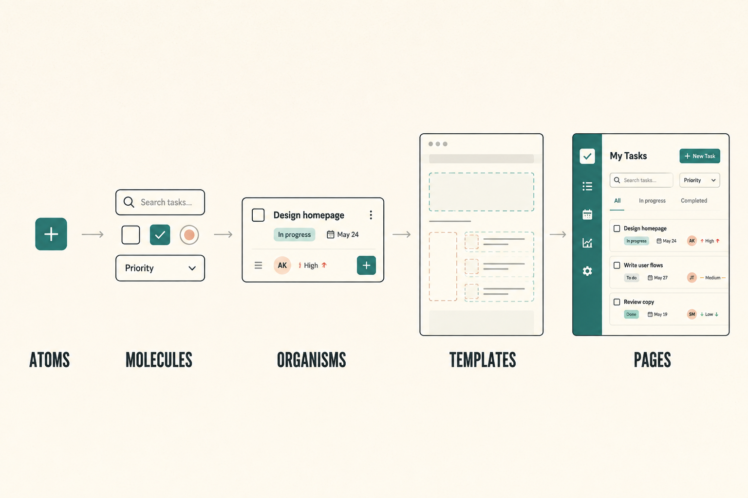
Brad Frost's Atomic Design gives us five connected ways to look at a system. They are not a rigid production order.
One small decision becomes part of a complete product experience.
01
Atom
A small reusable interface part
Button, checkbox control, icon
02
Molecule
A few parts working together
A field with a label, input, and helper message
03
Organism
A larger useful section
A task form containing fields and actions
04
Template
The arrangement before real content is added
A task-list page with places for a title and rows
05
Page
The arrangement with real content and states
Today, showing actual tasks or an empty state
Different teams may classify a part differently. Agree on language that helps people find and use things. Do not spend hours debating whether a complex button is technically an atom or a molecule.
Under the components
Foundations are the ingredients.
A component is a prepared, reusable part made with connected color, type, spacing, and effect decisions.
01Colors
Text, backgrounds, borders, icons, and effects.
02Strings
Font names, font styles, and reusable words.
03Numbers
Spacing, dimensions, corner radii, and typography measurements.
04Effects
Defined treatments such as shadows.
05Typography
Reusable combinations of font and spacing decisions.
Some people informally call foundations “electrons.” That is an optional teaching metaphor, not a sixth level in Frost's original model.
Scope the learning system
Build only what Daymark needs.
See tasks→Add a task→Mark complete
We will build buttons, fields, a checkbox, a text link, status text, task rows, and a small form. We will not add charts, date pickers, or elaborate navigation simply because other design systems have them.
Chapter 02
Organize your Figma file.
Give the source, the examples, and the instructions separate homes before the canvas becomes crowded.
Set up the file
Daymark / Design system
Create a new Figma Design file.
Name it Daymark / Design system.
Create the three pages shown here. Rename an existing page instead of leaving an unused Page 1.
Daymark / Design systemShare
FoundationsBase colors
Components
Patterns
00
Start
What the system is, how to use it, and release notes.
01
System
Foundations, main components, patterns, and their documentation.
02
Examples
Linked instances, real screens, and tests.
Inside 01 System
Create sections called Foundations, Components, and Patterns.
A section groups related work on the canvas. It does not store variables by itself. Inside Foundations, create a frame named Base colors. Start at 960 × 720. This is a working area for palette samples, not a product screen or a required system measurement. Increase its height if the samples need more room.
Write a short introduction
Explain the system before someone has to decode it.
Add your name as the owner and write Version 0.1, in progress.
Daymark helps people manage a short daily task list. This learning library contains the foundations and reusable parts for viewing, adding, and completing tasks. Use linked instances from the system. Check the component guidance before choosing a configuration. Record missing capabilities instead of forcing unrelated components into the design.
01 System
Main component
Add taskSource
→
02 Examples
Today
Review the task list
Add taskLinked instance
Main components belong on 01 System. Screens using those components belong on 02 Examples. You do not need a published library or plugin to begin.
Chapter 03
Understand variables, tokens, and styles.
Save white once. Connect it to two shapes. Then change the source and watch the system respond.
Save one value
Create neutral/0.
Open Variables from Figma's left navigation.
Create a Color variable.
Name it neutral/0.
Set its hex value to FFFFFF at 100% opacity.
Rename its collection to Primitives.
A collection is a group of variables. A variable is a saved value that other things can reference. The slash organizes the name. The zero names a shade; it does not mean zero opacity.
Both rectangles reference neutral/0. Change the source, not the shapes.
Primitivesneutral/0#FFFFFF
Color test AColor test B
In Figma: draw two rectangles at 120 × 80, name them Color test A and Color test B, then bind each Fill to neutral/0. If one stays white during the yellow test, it probably has a direct color instead of a variable binding.
Name the ideas
The idea, the mechanism, and the recipe.
Figma mechanism
Variable
Stores and links a value.
Color / neutral/0Design decision
Token
A named decision that can be shared between tools.
neutral/0 + its meaningVisual recipe
Style
A reusable combination of visual settings.
Family + weight + size + line height
A token is the design idea. A Figma variable is one way to represent it.
Not every Figma variable is a design token. A prototype counter can also be a variable. In this guide, variables hold individual reusable values while text styles hold complete typography treatments. Those text styles come later, after their ingredients are defined.
Chapter 04
Define your base colors.
Turn Daymark's raw color values into a small, named palette you can inspect and reuse.
Start with the raw value
A base color says what the color is.
In this guide, Base means the actual value, such as #345F49. Its name comes next. Its purpose comes after that.
We will group the palette into neutrals, brand colors, and accent colors. These categories explain the Daymark example; they are not mandatory for every company.
Value#345F49
→
Namegreen/600
→
PurposeChapter 05
The Daymark palette
13 opaque color variables.
Keep the neutral/0 variable you made in Chapter 3. Add the remaining values to the same Primitives collection.
Neutrals
Balance stronger colors and support surfaces, text, and boundaries.
07
neutral/0#FFFFFF
neutral/50#F6F7F4
neutral/200#D8DED5
neutral/500#6B7568
neutral/700#4F5B4B
neutral/900#20291F
neutral/950#121A14
Brand / Green
A five-shade family that helps Daymark feel recognizable.
05
green/100#E7F0EB
green/300#9CC8AC
green/600#345F49
green/700#274B39
green/800#1D392B
Accent / Red
A supporting color for a later error role—not an error token yet.
01
red/700#B42318
The numbers put shades in order. They do not state a percentage, contrast ratio, or exact amount of darkness.
Make the palette visible
Build a reference you can inspect.
Use the Base colors frame on 01 System. The visible samples make names, values, and variable bindings easier to compare.
01
Open 01 System, then the Base colors frame.
02
Add a heading called Neutrals.
03
Draw seven rectangles at 80 × 56, with 16 between them.
04
Bind every Fill to its matching neutral variable.
05
Put the variable name and hex value below each sample.
06
Repeat for Brand / Green and Accent / Red.
Give the white sample a thin outline if needed. The outline annotates the sample; it is not part of the white color value.
Chapter 05
Connect Base, Alias, and Mapped colors—including themes.
Move from raw values to purposeful color roles, then let one component reference resolve across Light and Dark.
01 · Name and purpose
A shade name is different from a purpose.
green/600 identifies a shade. color-background-action-primary explains why that shade is used. In this guide, Base is the raw value, Alias is the primitive name, and Mapped is a semantic or component-specific purpose.
In Figma, alias also means one variable referencing another. The teaching label Alias is not a separate variable type.
Create Light first. Set each Color variable as an alias to a primitive instead of copying its hex value.
page: neutral/50 → neutral/950
surface: neutral/0 → neutral/900
text primary: neutral/900 → neutral/50
text secondary: neutral/700 → neutral/200
control border: neutral/500 → green/300
divider: neutral/200 → neutral/500
icon primary: neutral/900 → neutral/50
action primary: green/600 → green/300
action hover: green/700 → green/100
action pressed: green/800 → neutral/0
text on action: neutral/0 → neutral/950
disabled background: neutral/200 → neutral/700
disabled text: neutral/700 → neutral/200
text link: green/600 → green/300
focus border: green/600 → green/300
error: red/700 → red/300
03 · Add Dark deliberately
Dark is mapped, not inverted.
Add red/300 = #FDA29B to Primitives, bringing the palette to 14 colors for a specific need. If your plan supports modes, add Dark and apply it to a parent frame so children inherit it.
If modes are unavailable, keep Dark as documented intent and label manual comparison frames honestly.
Create a Component collection with one mode. These aliases resolve through Theme.
button primary default → action primary
button primary hover → action hover
button primary pressed → action pressed
button primary disabled → disabled background
button text default → text on action
button text disabled → disabled text
Use the category-type-item-sub-item-state pattern only when the extra layer protects a real decision.
05 · Follow one connection
Trace the button back to its source.
The button default background points to action primary, which resolves to green/600 (#345F49) in Light and green/300 (#9CC8AC) in Dark. Background, text, icon, border, and focus remain separate connections.
Track alpha, paint opacity, and layer opacity independently. Omitted values mean 100%; two 50% settings compound.
Chapter 06
Define strings for fonts and content.
Separate reusable font names and interface phrases from user-generated product data.
01 · Strings are text values
One type, two jobs.
A string is a sequence of characters. Daymark uses strings to name font choices and to store reusable interface content.
02 · Font strings
Save the font ingredients.
Create these String variables in Primitives. Confirm each face exists in your Figma environment; a string does not install a font.
Bind one text layer to action/save-task, change it temporarily to Create task, verify the update, and restore it.
action/add-task · Add task
action/save-task · Save task
action/cancel · Cancel
action/retry · Retry
message/empty-title · No tasks yet.
message/empty-body · Add a task to start planning your day.
message/title-required · Enter a task title.
message/load-error · Tasks could not load.
message/loading · Loading tasks…
04 · What stays local
Do not turn product data into library phrases.
A person's task title is product data. A reusable button exposes an editable label; a screen may bind that label to a suitable content string.
Use sentence case and result-oriented labels. Add aliases only when several names intentionally share a maintained source.
Chapter 07
Define numbers for spacing, sizing, and more.
Give measurements names, units, roles, and live connections instead of treating 16 as self-explanatory.
01 · Numbers need purpose
A value is not a role.
The number 16 might mean padding, font size, or icon size. Preserve decimals and negative values when a system needs them; do not round another system into this exercise.
02 · Base number values
Create the numeric primitives.
Create Number variables and document their units.
space: 0, 4, 8, 12, 14, 16, 24, 32, 48px
radius: 0, 4, 8, 12px
stroke: 1, 2px
icon: 20px · control minimum: 48px
form maximum: 480px · content maximum: 1120px
font sizes: 12, 14, 16, 24, 28, 32px
line heights: 16, 20, 24, 32, 36, 40px
weights: 400, 500, 600
letter and paragraph spacing: 0px
opacity/full: 100% in this Figma exercise
03 · Map component numbers
Map numbers when the role matters.
Add Component aliases for button padding, gap, radius, and minimum height.
horizontal padding → space/16
vertical padding → space/14
content gap → space/8
container radius → radius/8
minimum height → size/control-min
04 · Gap, padding, and sizing
Spacing and resizing answer different questions.
Padding sits inside an edge; gap sits between children. Task rows use 16px padding, a 12px control-to-text gap, a 4px text-stack gap, and 8px between rows.
Fixed preserves a dimension, Hug follows content, Fill uses parent space, Minimum prevents shrinking, and Maximum prevents excessive growth. Long field errors make the field taller, not clipped.
05 · Try a connection
Change one bound gap.
Bind a two-line auto-layout gap to space/8, change it to 12, verify, and restore 8. Unsupported bindings should remain documented direct values—not invented connections.
Chapter 08
Bring font decisions together as typography.
Save complete text treatments while keeping contextual text color separate.
01 · Typography treatment
A font is an ingredient; typography is the treatment.
Typography selects, sizes, spaces, and arranges text for readability and hierarchy. Save each reusable treatment as a named text style.
02 · Create six styles
Build the Daymark type hierarchy.
All styles use Inter, 0px letter spacing, 0px paragraph spacing, left alignment, and normal casing unless a use explicitly changes alignment.
Heading / Page · Semi Bold 600 · 32/40
Heading / Section · Semi Bold 600 · 24/32
Body / Medium · Regular 400 · 16/24
Body / Small · Regular 400 · 14/20
Label / Medium · Medium 500 · 14/20
Caption · Regular 400 · 12/16
Text color is a separate semantic binding. The same Body style can work on different surfaces.
03 · Handle defaults
Preserve what the source actually says.
Explicit values win. Preserve Auto line height when a source uses it. Unknown or failed capture data is not a default and must not be replaced with invented values.
04 · Check real text
Test hierarchy with realistic content.
Use Today, Your tasks, Review homepage draft, and Due today, then try a longer title. Text must wrap without collision. Change Body / Medium temporarily to prove the style connection, then restore it.
Chapter 09
Prepare icons, surfaces, and effects.
Create only the visual foundations the task flow needs—and make intentional absence visible.
01 · Icons
Give icons a consistent home.
Create original 20×20 Plus and Check components. Use 2px rounded strokes bound to color-icon-primary. Plus means Add; Check means Selected or complete. Preserve the square frame and keep a text label when meaning may be unclear.
Plus lines: approximately (4,10)–(16,10) and (10,4)–(10,16)
Check path: approximately (4,10), (8,14), (16,6)
Inspect at 100% zoom; record source and license if adopting an external family
02 · Surfaces
Define surfaces by their job.
Use the page-background role for the page and surface role for inputs, rows, and forms. Control borders and decorative dividers stay distinct.
Controls use radius/8, task rows radius/12, and checkboxes radius/4.
03 · Effects
Effects are optional, not a checklist.
Core Daymark screens intentionally use no shadows, blur, noise, texture, or glass. For practice only, save Effect / Overlay practice.
Drop shadow · x 0 · y 8 · blur 24 · spread 0
neutral/950 at 16% shadow alpha
Test on two samples and preserve effect order when multiple effects exist
Chapter 10
Define responsive behavior.
Document the width conditions, adaptive values, and rearrangement rules instead of simply making everything smaller.
01 · What responsive means
Theme, width, and platform are separate contexts.
Responsive behavior rearranges or resizes appropriately as space changes. Daymark is responsive web; a narrow web frame is not automatically a native mobile specification.
02 · Define contexts
Use three authored width ranges.
Content max remains 1120px, form max 480px, and control minimum 48px in every context.
Medium · 768–1199px · 24px padding · heading 28/36
Wide · 1200px+ · 32px padding · heading 32/40
If modes or bindings are unavailable, create explicit styles and document manual selection honestly.
03 · What rearranges
Keep content; change relationships.
Wide and Medium headers put title and Add task in a row; Compact stacks them with 16px between. Fields fill their form. Rows and messages grow with content. Compact form actions stack; wider actions sit side by side. Do not hide important actions or errors to make a screen fit.
04 · Try the layout
Resize a content-driven frame.
Create a 390px frame with vertical auto layout and 16px padding. Put a Fill-width child inside, add two wrapping text layers with an 8px gap, and resize the outer frame.
Create one Primary button family whose anatomy, properties, states, focus, and resizing behavior remain connected.
01 · Button anatomy
Start with a purposeful source.
A component is the reusable source; an instance is a linked use; anatomy names meaningful parts. This button contains a container, optional leading icon, and required label.
02 · Label and container
Build the source with connected values.
Apply Label / Medium, on-action text, auto layout, Hug sizing, 48px minimum height, centered children, 16px horizontal and 14px vertical padding, 8px gap, radius/8, and the default button background. Remove unintended strokes and effects.
Content drives height. The 48px minimum must never clip a taller label.
03 · Optional icon
Add the approved nested icon.
Place a 20×20 Plus instance before Label, bind its strokes to the on-action color, and hide it initially. Hidden content must not leave an empty gap.
04 · Component controls
Expose a small, useful API.
Create the component and expose Label (Text, Add task), Show leading icon (Boolean, false), and Leading icon (Instance swap, Plus). Edit the main component and connect each property to the intended layer.
Combine four components as variants with a State property. Match layer names and properties, keep Default top-left, and bind each background to its state-specific component token. Disabled uses disabled text and does not activate.
06 · Focus
Document keyboard focus separately.
Use a 2px color-border-focus ring with a 2px gap, following the button outline without changing layout. A static Figma illustration is not proof of keyboard accessibility.
07 · Test the instance
Configure without detaching.
On Examples, change the label, toggle the icon, inspect all states, and try a long label. Let text wrap and height grow. Prototype pointer transitions only when useful; keep Disabled unconnected and document keyboard behavior separately.
Chapter 12
Build the remaining component families.
Apply the method to a field, checkbox, status label, and text link—each with its own job.
01 · Build only what is needed
Different purposes deserve different components.
Do not disguise fields, checkboxes, status, or navigation as variations of the button simply because the button was built first.
02 · Field
Enter one short text value.
Build Label, Input surface with Value, and Message in vertical auto layout. Use 12px input padding, 48px minimum height, radius/8, surface background, control border, and wrapping text. Expose Label, Value, Message, and Show message.
Default · surface + control border + secondary message
Error · error border and message; preserve label and value
Disabled · disabled background and value
Focus rings the input surface, not the whole group; error and focus may coexist
In code, connect the visible label and error programmatically. The Figma drawing does not supply semantics.
03 · Checkbox
Separate the visible box from its interaction area.
Center a 20px Box inside a 48×48 control. Create Unchecked, Checked, Disabled unchecked, and Disabled checked. Build Labeled from the control plus wrapping Body / Medium text; expose Label and nested State.
Implementation must associate label and control, support Space, and keep disabled controls inert.
04 · Status label
Communicate; do not activate.
Use Body / Small with secondary text and no container decoration. Create Open and Completed variants. The words carry the distinction; these are not buttons or filters.
05 · Text link
Use a link to go somewhere.
Use Body / Medium, underline, and color-text-link. Expose Label. Cancel navigates to Today and sits in an interaction area at least 48px high. Keep underline visible across pointer states and document focus.
06 · Choose correctly
Purpose determines the component.
Primary button submits or performs the main action. Field accepts short text. Checkbox selects independently. Status label reports state. Text link navigates. Record a gap when none fits; do not force a similar-looking control into the wrong job.
Chapter 13
Combine components into patterns.
Connect reusable parts into arrangements that solve recurring product needs.
01 · What is a pattern?
A pattern solves a recurring need.
Task row helps someone identify a task, understand status, and mark it complete. Its usefulness comes from the relationship, not the attractiveness of its parts.
02 · Task row
Preserve the nested relationships.
Combine Checkbox / Control with a Fill-width text stack containing Title, optional Due text, and Status label. Use 12px horizontal gap, 16px padding, top alignment, surface background, radius/12, and a 480px source preview.
Expose Title, Due text, and Show due text
Open = Unchecked + Open status
Completed = Checked + Completed status
Hidden due text closes its gap; long titles increase row height
Product logic must update checkbox and status from one task state. Matching drawings are not proof of synchronized behavior.
03 · Task form
Compose the form as a documented pattern.
Use a Fill-width, Hug-height vertical frame with 24px gap and 480px maximum. Add Task title Field, Save task button, and Cancel link. Compact stacks actions; Medium and Wide place them in a row.
Do not make a rigid parent component until repeated use and controlled properties justify it.
04 · Form behavior
Document what the arrangement must do.
Empty submission shows Enter a task title. Valid submission saves. Saving prevents duplicates and communicates progress. Failure preserves input and enables retry. Cancel returns to Today.
A Disabled button labeled Saving… is a static pending-action demonstration, not a complete runtime behavior.
Chapter 14
Build templates, screens, and a prototype.
Move from connected parts to real Daymark states at wide, medium, and compact widths.
01 · Define templates
Structure first; real content tests it.
Today contains a page header and task-list region. Add task contains a page heading and Task form.
02 · Today / Wide
Build the populated Today screen.
Create Today / Wide / Light at 1440×1024. Use page background, Wide context, 32px padding, centered 1120px-max content, a Today heading, 48px-high Add task link area, and three linked rows.
Review homepage draft · Open
Prepare the client presentation · Open
Send project update · Completed, no due date
The frame height is a viewport, not a content maximum.
03 · Add task
Build the form screen.
Use the same page structure with Add task heading and a left-aligned 480px-max Task form. Create empty, filled with Book the project review, and error versions.
04 · Real screen states
Include what people actually encounter.
Add populated, empty, loading, and failed Today states plus error, saving, save-failure, and saved form states. Add message/save-error only when that new state needs it.
Empty · No tasks yet. + empty-body message
Loading · Loading tasks…; never a false empty state
Failed · Tasks could not load. + Retry
Save failure · preserve input + Task could not be saved. Try again.
05 · Adapt the screens
Use the same content at 834 and 390px.
Apply Chapter 10 context values. Compact stacks header and form actions. Resize between examples and inspect wrapping before changing type or adding components.
06 · Prototype
Connect a truthful click-through.
Connect Add task, Cancel, and filled Save task. Optionally route empty submission to error. Label simulated behavior. A click-through is not a database, validation engine, or keyboard-accessible application.
Chapter 15
Test the system.
Replace assumed consistency with a test record that shows what changed, what held, and what remains unknown.
01 · Test connections
A polished source page is not proof.
Record item, configuration, theme, width, test, expected result, observed result, and Pass, Fail, or Not tested status.
02 · Core checks
Test every important connection.
Restore temporary changes after each check.
Color and numeric source changes
Typography style changes
Long and missing content
Every documented state
Light and Dark mappings
Sample widths and breakpoint boundaries
Instances for detachment and unexplained overrides
03 · Accessibility
Check design evidence at the right stage.
Inspect readable pairs, visible labels, focus appearance, target dimensions, and errors that do not rely only on color. Normal text contrast is 4.5:1; qualifying large text is 3:1, with defined exceptions. Daymark's 48px target is an exercise choice; WCAG 2.2 AA target-size minimum is 24×24 CSS px with exceptions.
Runtime keyboard order, names, associations, announcements, zoom, reflow, and focus must still be tested in code.
04 · Fix the source
Repair the responsible source, then retest.
If an error clips, inspect message resizing and wrapper height before editing individual instances. Shared fixes can also create shared regressions.
Chapter 16
Document how to use the system.
Help another person choose correctly—not merely recognize a screenshot.
01 · Help people choose
Document the decision around the component.
For each main component, record identity, purpose, use and avoid conditions, anatomy, configuration, values, behavior, adaptation, content, and evidence.
02 · Write one useful entry
Be specific enough to act on.
Field is for one short text value such as a task title. Keep a visible label. Preserve input on error, show a specific wrapping message, and let the field grow. Do not use it as a date picker, rich-text editor, or file uploader.
This is more useful than saying Use fields thoughtfully.
03 · Do not invent intent
Separate observation from approval.
Three green buttons do not prove other colors are prohibited. The Daymark recipes are authored decisions; your test results are separate evidence of whether you implemented them successfully.
Chapter 17
Share, release, and maintain the library.
Treat Version 0.1 as a reviewed release with scope, evidence, ownership, and a path for change.
01 · Release
A release is a reviewed set of changes.
Inspect names, bindings, states, examples, and documentation. Record Added, Changed, Tested, Known gaps, and Owner. Never claim a context passed unless you tested it.
02 · Publish when supported
Prove the distribution path you actually have.
When available, publish intended variables, styles, and components, enable the library in a consumer file, accept an update, and verify it. Otherwise test same-file instances and label the result a single-file learning library.
03 · Change safely
Do not break trust to move quickly.
Record the problem and consumers, check existing options, justify additions, test the source change, communicate migrations, and retain deprecated assets for an agreed transition.
Detachment, repeated overrides, and duplicates are feedback about system fit—not proof that users are careless.
Chapter 18
Prepare developer handoff, including Specs Classic.
Transfer anatomy, values, behavior, accessibility, and unresolved questions—not screenshots alone.
01 · Hand over decisions
Make Field / Error implementable.
Include source and version, anatomy and properties, type and measurements, resizing and bindings, supported themes, short and long errors, validation and keyboard expectations, responsive rules, and open questions with owners.
Share font and icon rights and inspect SVG exports for clipping or unexpected backgrounds.
02 · Specs Classic
Use automated specs as evidence, not intent.
Check current plugin instructions, run it on a documentation copy, compare generated output with hidden parts, nesting, and variants, then add usage, behavior, responsive, and accessibility guidance. Identify the source version and refresh when it changes.
Verify minimum—not fixed—height, wrapping label and error, correct border token, accessible name and message association, non-color invalid state, visible focus, and breakpoint behavior. Record real code names only after they exist.
Chapter 19
Make the system understandable and usable by AI.
Create maintained design context that distinguishes a specification from access to a real reusable implementation.
01 · Why an AI document?
Give builders maintained context.
A useful design.md states what exists, what it is for, how it is configured, and where real reusable resources can be accessed. A component name without anatomy, states, properties, and measurements still leaves the builder guessing.
02 · Specification vs reuse
Description is not executable access.
Reconstruction creates a new implementation from a specification. Reuse imports or inserts an existing component through supported options. Markdown cannot become React, native code, or a Figma instance by itself.
If implementation access is missing, an assembly-only workflow must report the gap—not recreate and call it reuse.
03 · What belongs inside
Document authority, contracts, and evidence.
Include identity, assembly policy, exact foundations, alias relationships, modes and contexts, catalog IDs, component contracts, composition rules, implementation access, verification, unknowns, omissions, deprecations, and changes.
Fact: Minimum height is 48px. Instruction: Use for the main action in a decision area. Limitation: No destructive-action variant is provided. Retain both references and resolved values; record direct values as direct.
05 · Assembly policy
Use the catalog only when it fits.
Understand the need, find approved resources, use only fitting parts, configure within documented options, preserve documented composition, flag missing capabilities, avoid forced alternatives, and continue independent supported work while gaps remain explicit.
06 · Scoped contract
Start with one self-contained component contract.
The manuscript's Primary button example documents identity and authority, assembly policy, catalog, missing implementation access, defaults, required primitives and mappings, Label / Medium typography, purpose, properties, anatomy, geometry, bindings, resolved Light and Dark states, focus, behavior, content, adaptation, unsupported cases, verification, gap reporting, and change history.
Default: Light #345F49/#FFFFFF · Dark #9CC8AC/#121A14
Hover: Light #274B39/#FFFFFF · Dark #E7F0EB/#121A14
Pressed: Light #1D392B/#FFFFFF · Dark #FFFFFF/#121A14
Disabled: Light #D8DED5/#4F5B4B · Dark #4F5B4B/#D8DED5
Its status remains authored teaching specification until real Figma or code access and tests exist.
07 · Expand carefully
Preserve connections as the document grows.
Task row must reference Checkbox and Status label. Field needs message, resizing, error, and focus behavior. Preserve source IDs and skipped token layers. Use an index only when consuming tools can retrieve linked records.
08 · Test with AI
Compare supported, demanding, and unsupported tasks.
Test a normal Save task button, a long constrained Dark version, and an icon-only destructive request. Hold model, task, assets, and access constant in A/B runs. Inspect component choice, supported options, measurements, genuine reuse, gap reporting, and honest limitations.
Revise the smallest unclear part when a mistake repeats and keep the document version aligned with the library release.
10 · Completion checklist
Verify the whole connected project.
Confirm the system explanation, organized source and owner, 14-color evolved palette, semantic mappings, separate font and content strings, named numeric units, exact typography, reusable licensed icons, intentional effects, responsive rules, useful component properties and states, nested patterns, realistic screen states, recorded tests, use and avoid guidance, release scope, behavioral handoff, honest AI access, and explicit unsupported needs.
11 · Glossary
Use one shared language.
Foundation is an underlying decision; token is a named decision; variable stores a referenced value; alias links variables; semantic names purpose; collection groups variables and modes; mode changes context; binding is the live connection; style is a reusable visual recipe; component is a source; instance is a linked use; property configures it; variant is a supported configuration; state is a condition; anatomy names parts; pattern solves a recurring need; template structures content; breakpoint defines a width condition; handoff transfers implementation knowledge; deprecated means retained but discouraged.